What Makes Content Go Viral? Scraping Deadspin To Find Out

In order to drive clicks, A Random Walker clearly needs more exciting content than just scintillating R output and a third person bio section.

For clues on how best to attain said glorious traffic (along with an excuse to write a web scraper), I turned to sports blog Deadspin. Founded by Will Leitch in 2005 and driven by the tagline "Sports News without Access, Favor, or Discretion," Deadspin has thrived in a competitive (read: virtually impossible) media environment, leaving behind initial critical skepticism to become a publisher of highly-regarded longform posts.

To scrape Deadspin, I used RSelenium, an R package that gave slightly more flexibility than options like rvest. For a particular Deadspin link I returned an article's headline, writer, date published, page views, and tags. After running the scraper for a few hours (days) and doing some data cleanup, I ended up with metadata for 52,090 articles. Total page views summed to slightly under 2.7 billion; this presumably generates significant ad revenue even in a post-newspaper world. While the dataset is by no means the entire Deadspin corpus, it ought to be enough to get some "actionable insights." Finally, if you're interested in replicating/critiquing/giving feedback, all my code (and data!) can be found here.

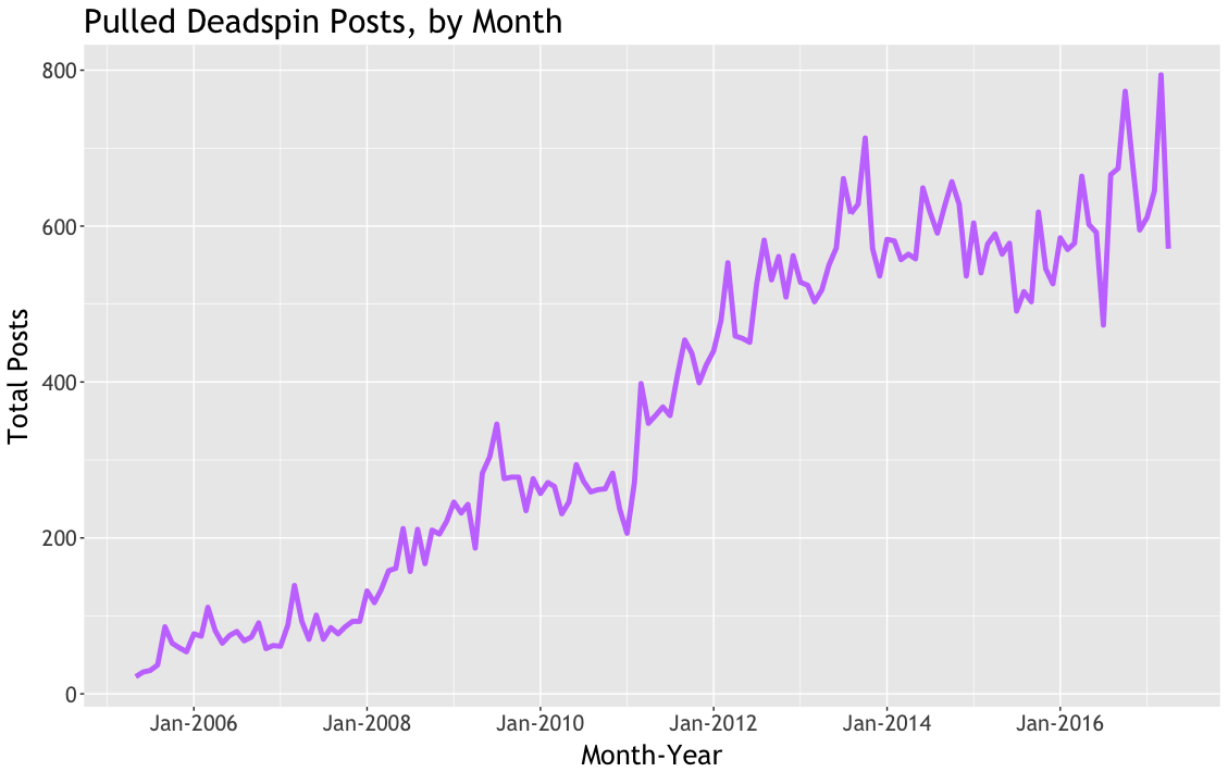
As an initial look at the data, the chart below shows total articles scraped by publication month. The increasing trend is probably a mix of both Deadspin's growth and the scraper's propensity to find more recent links.

Enough data discovery. Time to learn how to generate buzz on the Internet!

Lesson 1: Viral Content Is Random

Well it was important not to get one's hopes up. Presenting Deadspin's most viewed post of all-time, with a healthy six million+ lead over second place:

It's a video of people failing to pour ice water over their heads.

Lesson 2: Viral Content Does Not Showcase The Best In Us

The effect of hashtagable #viral #content can be seen when looking at Deadspin's average page views per post by month:

It's clear that one or two viral articles can significantly boost the traffic of even a site Deadspin's size. Digging into the relevant dates:

October 2010: A month that lives in infamy. A.J. Daulerio posts details of Brett Favre's correspondence with Jenn Sterger. The world finds out more than it ever wanted to know about the gunslinger's extramarital affairs. This scoop felt exceptionally sleazy at the time- mainly because Sterger did not want it to run, leading Daulerio to source the info from a third party- and doesn't look much better now. Daulerio, of course, ultimately became part of an even bigger story.

August 2014: The aforementioned ice bucket anthology is posted, as is video of Tony Stewart hitting and killing Kevin Ward Jr. in a sprint car race. The legal ramifications from the crash are still ongoing. I think the ethics of posting a video of someone getting killed are pretty questionable, so as with Favre this does not stand out as a high point in Deadspin's history.

In general, the ice bucket challenge video differs from Deadspin's most viewed articles in that it is not very shocking. While some lighthearted articles achieve huge numbers, the majority are quite dark, or at least stunning in some sense.

Lesson 3: Hire Drew Magary

Lesson 4: Write About Politics

One of my reasons for scraping Deadspin was that the site does a nice job tagging every article, meaning that topics can easily be tracked over time.

To measure the popularity of tags I compared the page count of each article featuring a given tag to the median page count of all articles posted in the same month. This is a quick and dirty way to adjust for the upward trend in overall Deadspin traffic. Using median monthly traffic (plotted below) as a benchmark gives slightly more stability than using the average traffic numbers shown above. As a sidenote, I think there is evidence that Deadspin traffic has declined slightly since January 2016, but it's hard to quantify the decline from this dataset without spending more time figuring out how quickly articles amass most of their total pageviews (i.e. does it take a week, a month, or a year etc.)

The scatterplot below shows the top 40 tags by "average views above monthly median," limiting to only tags appearing in at least 100 articles:

For the uninitiated, "Balls Deep" is a common Drew Magary column pseudonym. Magary writes several regular features for Deadspin, spans a wide audience as an accomplished novelist and a correspondent for GQ, and has been labelled the most "actually-read" author on the internet. Finally, Drew is a former Chopped champion and a terrible dancer:

drew_gif.gif

Looking further at the top tags, it's easy to see how and why Deadspin has broadened from a sports-only sports blog to a much more general purpose site. This shift accelerated with the arrival of several former Gawker writers, and is reflected in the prominence of the 'Election 2016', 'Donald Trump,' and 'Politics' topics. Apparently all websites are converging to an "all politics all the time" equilibrium.

Lesson 5: The World Is Not Ready For Your Pop Culture, Soccer, Tennis, or NHL Takes

On the other end of the spectrum, there are some obvious choices for what doesn't go viral:

It appears that the Deadspin readership is not prepared to share pop culture articles with their friends on Facebook, nor detailed soccer analysis (note that Screamer is Deadspin's soccer sub-blog). To see takes on dogs ranked so low indicates major societal issues beyond the scope of this article.

Conclusions

  • Viral content is pretty random (duh) and likely depends mainly on what your extended family is willing to share on Facebook.
  • Negative stories get clicks, from topics like racism and domestic violence to Duke basketball.
  • Drew Magary writing about politics all the time makes sense.

Bonus Charts!

Here are all Deadspin writers with at least 500 articles found, plotted by the date ranges of their posts:

Takeaways here include that Barry Petchesky is an absolute machine and that Deadspin could stand to prioritize gender diversity.

Finally, there is evidence that Deadspin has grown up over time. I used the readability package in R to measure the grade level of Deadspin headlines by year and found somewhat of an increasing trend:

The methodology was successfully validated by checking the lowest ranked individual headline.

How Important Are Small Businesses?

While President Trump gets all the headlines on Twitter, true connoisseurs of the executive branch know to also follow VP Mike Pence's account.

Pence exists as the level-headed counterweight to POTUS's incessant bluster. He is reassuringly robotic, and while his backwards views are somewhat (OK, very) problematic, he at least appears capable of avoiding nuclear war. Like a throwback to a more innocent age, Pence's tweets are filled with generic politician boilerplate, from meeting kids in the Capitol Hill rotunda to telling very interesting anecdotes about his new desk.

Looking to learn more about psyche of the man whose dining habits have spawned far too many thinkpieces, I dug into Pence's tweet history for information. It soon became apparent that Mike Pence absolutely ADORES small business:

This reverence towards small business is not particularly unusual for a Republican. A traditional GOP stump speech comes stuffed with references to "job-killing" regulations that are holding back the nation's hard-working small business owners, and, by sheer coincidence, also holding back the nation's large business owners/Republican party donors.

However, to understand if preaching the gospel of small business is still a viable political strategy in 2017 I believe it is worth considering the following questions:

1. Does Small Business Matter to America's Economy?
2. Does Small Business Matter More to Republicans?

To tackle these with data I looked to the US Census Bureau's County Business Patterns (CBP) dataset. The CBP dataset provides summaries of the number of businesses (along with employee counts and total payroll) by both county and industry, allowing for a deep-dive analysis into small business trends by region. The catch is that the data is only available through the end of 2014, so the numbers here will be a touch out-dated.

I paired the CBP data with county-level 2016 Presidential election results to assess if small business is more influential in Republican-held areas.

If you're interested in replicating/critiquing/giving feedback, all my code can be found here.

Onwards!

1. Does Small Business Matter to America's Economy?

The chart below shows the percentage of total businesses, payroll, and employees falling into each of nine employee-count buckets defined by the Census bureau (all data from 2014).

Perhaps unsurprisingly, businesses with 1-4 employees make up the majority of US firms but a relatively small portion of total payroll and hiring. Combine the first three buckets, though, and you find that businesses with under 20 employees contribute a little over 20% of total hiring and payroll. Not huge, but not insignificant either.

And for those of you that think data visualization is overrated, here are the raw numbers:

Employer Size % of Employees % of Companies % of Pay
1 to 4 5.8% 54.5% 5.5%
5 to 9 7.7% 18.6% 5.9%
10 to 19 10.8% 12.8% 8.5%
20 to 49 16.6% 8.8% 13.8%
50 to 99 12.7% 3.0% 11.5%
100 to 249 15.9% 1.7% 15.8%
250 to 499 9.3% 0.4% 10.6%
500 to 999 6.8% 0.2% 8.7%
1000+ 14.4% 0.1% 19.6%

However, a counter-argument to small business enthusiasts could be that firms with only a few employees tend to not be in great industries. Indeed, a trend in the chart above is that the employee percentage is higher than the payroll percentage for small businesses, indicating that these workers are earning less than those at larger firms.

To look at industry differences between firms of various sizes I aggregated the nine Census-defined buckets into a Small/Mid-Size/Large classification. Firms were matched to industries based on their three-digit North American Industry Classification System (NAICS) code. This code was provided with the Census CBP data and gives a very rough idea of what on earth a business is doing. The codes actually range from two-digit (most aggregated) to six-digit (most granular), although I found that missing data started to be a big problem when looking beyond two and three digit codes.

In any case, the charts below show the number of industry employees working in firms of a given size (small, mid-size, or large) against that number as a percentage of the industry's total workforce. For example, "Food services and drinking places" is the single largest industry for small (under 20 worker) firms, even though the small firm workforce makes up only about 26% of the industry's total.

From this data we see that "Food services and drinking places", "Professional, scientific, and technical services," and "Ambulatory health care services" are the largest industries for small firms. What are these? Checking some BLS definitions we see that jobs like cooks, servers, accountants, architects, medical assistants, physicians, and dentists are all included. So it's quite broad.

Still, while these jobs might not get the most press, I would note that many of them seem quite automation-proof due to their customer service component.

To answer the first question: small business make up a solid (>20%) portion of US economic output, although workers in small firms tend to earn a little less than those in larger businesses. In addition, three-digit NAICS codes are not very useful. On to question two:

2. Does Small Business Matter More to Republicans?

To begin with, here is a map showing county-level election results from 2016. My main takeaways are that a) geographic visuals really make Republicans look good, and b) making this map in R took a lot of effort. A nice tutorial on using shape files can be found here.

election_map.png

Before looking at the relationship between the Republican vote and small businesses, it's useful to note the relationship between the Republican vote and population. The chart below plots 2016 county-level GOP vote percentage on the y-axis against the natural log of county votes cast. I'm using vote count here as a proxy for population, but it is interesting just how much better Republicans do in areas with lower vote totals. Based on Republican rural strength I'd imagine that adjusting for area through a pop/mile metric would yield an even stronger relationship.

Not a shock, but it also turns out that counties with lower vote totals tend to have fewer employees per firm. To get this chart I estimated the number of workers per firm in each county using the 2014 CBP data. Some hacky interpolation was needed due to missing/bucketed data, so this chart probably shouldn't end up on reddit or 538...but in any case it appears that areas where Republicans are strongest also tend to have the lowest number of employees per firm.

To finish, we have the same county-level chart as above, except colored by whether the GOP or Democrats won the county in 2016.

I think what's interesting here is that the Republican county distribution is (pretty much) overlaid on top of the Democrat distribution in places where the vote totals are similar. To me this indicates that, for a given county size, the influence of small business is about the same in Republican vs Democratic held areas...it just so happens that Republicans control the majority of the smaller counties. For this reason I think it still makes sense for Pence and co. to push a pro-small business message, even though Republican counties aren't more likely to rely on small businesses once you control for size.

Conclusions:

  1. Continuing to tweet about small business is likely a viable political strategy for Pence. Small business still retains a strong influence on the US economy, especially in industries that I (albeit with zero concrete evidence) do not think are going away soon.
  2. Areas where Republicans voters live (i.e. more rural counties) have a greater reliance on small business (as measured by employees per firm). Not a huge surprise.
  3. Making charts in ggplot2 still takes me forever.